I HAVE BEEN BUILDING SOME NEW VISUALIZATIONS to study house price trends. In particular I have been thinking about rates of change of rates of change, or accelerations and decelerations in house price trends. I’ve got more to say on this topic, but for today, let’s create a few visualizations and contemplate an animation.
Per usual we’ll use R to create some plots.
Also, for more house price visualizations check out Visual Meditations on House Prices and Plotting Recent House Price Trends
Data
For today’s visualizations we’ll use the recently released FHFA House Price Index. We can download these files via a flat text file available on the FHFA webpage.
The following code will download the state house price data and perform some transformations.
#load some libraries
library(data.table)
library(tidyverse)
## Loading tidyverse: ggplot2
## Loading tidyverse: tibble
## Loading tidyverse: tidyr
## Loading tidyverse: readr
## Loading tidyverse: purrr
## Loading tidyverse: dplyr## Conflicts with tidy packages ----------------------------------------------## between(): dplyr, data.table
## filter(): dplyr, stats
## first(): dplyr, data.table
## lag(): dplyr, stats
## last(): dplyr, data.table
## transpose(): purrr, data.tablelibrary(scales)##
## Attaching package: 'scales'## The following object is masked from 'package:purrr':
##
## discard## The following object is masked from 'package:readr':
##
## col_factorlibrary(viridis)## Loading required package: viridisLitelibrary(ggjoy)
library(geofacet)
#read in data available as a text file from the FHFA website:
fhfa.data<-fread("http://www.fhfa.gov/DataTools/Downloads/Documents/HPI/HPI_PO_state.txt")
#create annual house price growth in the SA index:
fhfa.data[,iso_3166_2:=state] #rename state to match usa_composite
fhfa.data[,date:=as.Date(ISOdate(yr,qtr*3,1))] #make a date (don't need it here)
fhfa.data[,mylabel:=paste0("Q",qtr,":",yr)] #create date label for plot
##############################
### Compute rates of change:
##############################
# 4 quarter percent change
fhfa.data[,hpa4:=index_sa/shift(index_sa,4)-1,by=state]
# 1-quarter percent change at annualized (4-quarter) rate
fhfa.data[,hpaq:=(index_sa/shift(index_sa,1))^4-1,by=state]Now that we have the data, let’s plot it. We’ll use a geofacet layout for the state house price trend plots.
ggplot(data=filter(fhfa.data, year(date)>1999),
         aes(x=date,y=hpa4,label=round(hpa4,0)))+
  geom_line()+theme_minimal()+
    geom_ridgeline_gradient(aes(fill=hpa4,y=0,height=hpa4),min_height=-10)+
    scale_fill_viridis(option="C")   +
  scale_y_continuous(labels=percent)+
  scale_x_date(date_labels="%y",date_breaks="5 years")+
  labs(x="", y="",
       title="House price appreciation by state: 2000Q1 - 2017Q2",
       subtitle="4-quarter percent change in house price index",
       caption="@lenkiefer Source: FHFA purchase only house price index (SA)")+
  theme(plot.title=element_text(size=14,face="bold"),
        legend.position="none",
        plot.subtitle=element_text(size=10,face="italic"),
        plot.caption=element_text(hjust=0,size=8),
        axis.ticks.length=unit(0.25,"cm")) +
    geom_hline(yintercept=0,color="black",linetype=2)+
    facet_geo(~ state, grid = "us_state_grid2")
Now let’s focus on comparing recent quarterly annualized percent change in house prices to the 4-quarter percent change in house prices in several large states:
ggplot(data=fhfa.data[yr>2014 & state %in% c("CA","TX","FL","WA","CO","NC")], aes(x=date,y=hpa4,group=state))+
  geom_line(size=1.05,aes(linetype="4-quarter % change",color="4-quarter % change"))+
  geom_line(size=1.05,aes(y=hpaq,linetype="quarterly % change (annual rate)",color="quarterly % change (annual rate)"))+
  scale_linetype_manual(values=c(1,2),name="State HPA")+
  scale_shape_manual(values=c(21,16),name="Indicates")+
  scale_color_manual(values=c("#4575b4","#d73027"),name="State HPA")+
  facet_wrap(~state)+theme_minimal()+
  scale_y_continuous(labels=percent)+
  theme(legend.position="top",
        plot.caption=element_text(hjust=0))+
  labs(x="",y="",
       title="Recent house price appreciation trends by state",
       subtitle=paste0("data through:",tail(fhfa.data,1)$mylabel),
       caption="@lenkiefer Source: FHFA purchase only house price index (SA)")
Here we can see that though the quarterly estimates are noisy, in some states they are trending up, but in others appear to be trending down.
Let’s try another way of looking at these data:
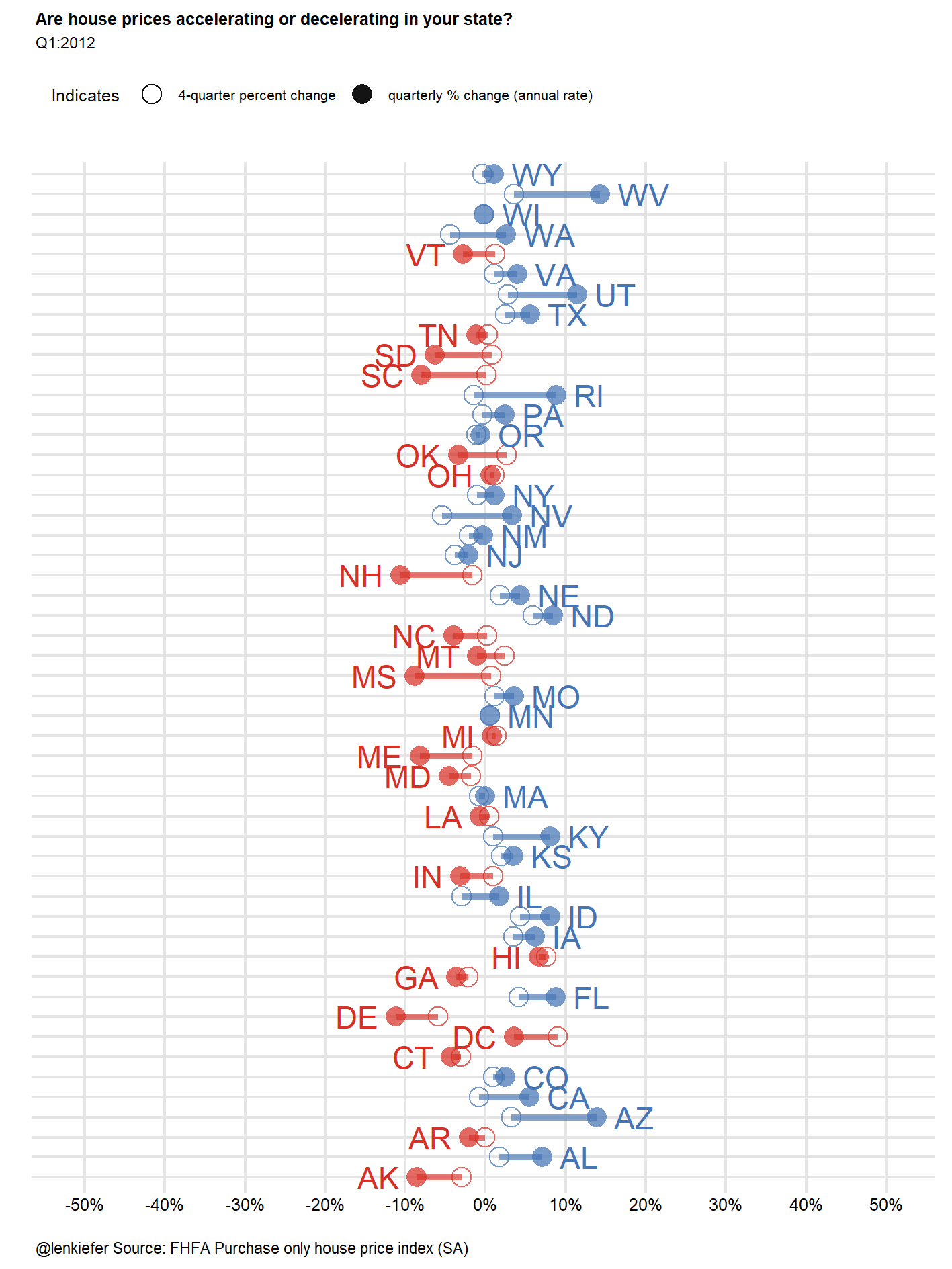
df<-fhfa.data[date==max(fhfa.data$date,na.rm=T),]

myplot0<-function(in.df=df){
  g<-
    ggplot(data=in.df,
           aes(
             x=forcats::fct_reorder(state,hpaq,fun=last),
             xend=forcats::fct_reorder(state,hpaq,fun=last),
             y=hpaq,label=paste(" ",state," "),
             hjust=ifelse(hpa4>hpaq,1,0),
             linetype=ifelse(hpa4>hpaq,"Decelerating","Accelerating"),
             color=ifelse(hpa4>hpaq,"Decelerating","Accelerating")
           ))+
    geom_segment(aes(yend=hpa4),size=1.1,alpha=0.65)+
    geom_point(aes(shape="quarterly % change (annual rate)"),size=3,alpha=0.72)+
    geom_point(aes(shape="4-quarter percent change",y=hpa4),size=3,alpha=0.72)+
    geom_text()+
    scale_linetype_manual(values=c(1,1),name="State HPA")+
    scale_shape_manual(values=c(21,16),name="Indicates")+
    scale_color_manual(values=c("#4575b4","#d73027"),name="State HPA")+
    coord_flip()+
    theme_minimal()+
    facet_wrap(~ifelse(hpa4>hpaq,"Decelerating","Accelerating"),scales="free_y")+
    theme(legend.position="top",
          axis.text.y=element_blank(),
          plot.caption=element_text(hjust=0))+
    labs(x="",y="",
         title="Are house prices accelerating or decelerating in your state?",
         subtitle=head(in.df,1)$mylabel,
         caption="@lenkiefer Source: FHFA Purchase only house price index (SA)")+
    scale_y_continuous(labels=percent,limits=c(-.25,.25),breaks=seq(-.5,.5,.05))
  return(g)
}
myplot0()
Animated plot
Let’s try to animate it:
Scatterplot
We can try a scatterplot too:
library(ggrepel)
df<-fhfa.data[date==max(fhfa.data$date,na.rm=T),]

g<-ggplot(data=df,
           aes(x=hpaq, y=hpaq-hpa4,label=paste(" ",state," "),
               color=ifelse(hpa4>hpaq,"Decelerating\n(q/q % change at annual rate < y/y % change)","Accelerating\n(q/q % change at annual rate > y/y % change)" )))+
  geom_text_repel()+
  geom_point()+
  geom_hline(yintercept=0,linetype=2,color="black")+
  scale_color_manual(values=c("#4575b4","#d73027"),name="State HPA")+
  theme_minimal()+
  theme(legend.position="top",
        plot.caption=element_text(hjust=0))+
    labs(x="quarterly percent change in house prices (at annual rate)",
         y="quarterly percent change at annual rate minus\n4-quarter percent change in house prices",
         title="Are house prices accelerating or decelerating in your state?",
         subtitle=paste0(head(df,1)$mylabel,
                         "\ndots above (below) the dotted line are experiencing accelerating (decelerating) house prices."),
         caption="@lenkiefer Source: FHFA purchase only house price index (SA)")+
  scale_y_continuous(labels=percent)+
  scale_x_continuous(labels=percent)


g
These plots need some work. The animation is capturing not only the change in house prices and the change in change in house prices (acceleration/deceleration), but it’s also capturing the change in the change in the change in house prices (change in acceleration/deceleration). That’s tricky to grasp.
Maybe we can better visualize these trends in a different way. We’ll try out some other visualization ideas I have in a future post.