---
title: "Tableau to Fexdashboard by @lenkiefer"
output:
flexdashboard::flex_dashboard:
orientation: columns
vertical_layout: fill
social: menu
source_code: embed
theme: readable
---
```{r setup, include=FALSE}
library(flexdashboard)
library(plotly)
library(crosstalk)
library(data.table)
#devtools::install_github("hrbrmstr/albersusa")
library(albersusa)
library(ggalt)
library(ggthemes)
library(rgeos)
library(maptools)
library(viridis)
library(DT)
library(scales)
library(htmltools)
us <- usa_composite()
us.map <- usa_composite("laea")
df<-fread("data/mig2015.txt")
us<-albersusa::usa_composite()
us_map <- fortify(us, region="name")
states_map <- map_data("state") # state data for map
#Compute share of in-migration and out migration
df[,total.to:=sum(total),by=state.from]
df[,total.from:=sum(total),by=state.to]
df[,share.to:=total/total.to]
df[,share.from:=total/total.from]
df[,share.to.d:=scales::percent(share.to)]
df[,share.from.d:=scales::percent(share.from)]
df[,text.from:=paste0("Number moving out of ",state.from," to ",state.to,":",comma(total)," (",percent(share.from)," of total)")]
df[,text.to:=paste0("Number moving into ",state.to, " from ",state.from,":",comma(total)," (",percent(share.to)," of total)")]
df2<-df[state.to=="California"]
df.from<-group_by(df,state.to)
df.to<-group_by(df,state.to)
sd.from <- SharedData$new(df.from, ~state.from,group="state")
sd.to <- SharedData$new(df, ~state.to,group="state")
sd.table <-SharedData$new(df[,c("state.to","state.from","total","share.to.d","share.from.d"),with=F],~state.to,group="state")
sd.pick<-SharedData$new(df[state.to==state.from],~state.from,group="state")
# give state boundaries a white border
l <- list(color = toRGB("white"), width = 2)
# specify some map projection/options
g <- list(
scope = 'usa',
projection = list(type = 'albers usa'),
showlakes = TRUE,
lakecolor = toRGB('white')
)
p1 <- plot_geo(sd.from, locationmode = 'USA-states',height=400) %>%
add_trace(
z = ~share.to, locations = ~statecode.to,text=~text.to,hoverinfo="text",
color = ~share.to , colors = 'Blues'
) %>%
add_trace(data=sd.pick,
z = NA, locations = ~statecode.to,
color = "white" ) %>%
colorbar(title = "% of total out") %>%
layout(
title = 'State-to-State Migration
Where did people go?',
geo = g
)
p2 <- plot_geo(sd.to, locationmode = 'USA-states',height=400) %>%
add_trace(
z = ~share.from, locations = ~statecode.from,text=~text.to,hoverinfo="text",
color = ~share.from , colors = 'Blues'
) %>%
add_trace(data=sd.pick,
z = NA, locations = ~statecode.to,
color = "white" ) %>%
colorbar(title = "% of total in") %>%
layout(
title = 'State-to-State Migration
Where did people come from?',
geo = g
)
```
R flexdashboard
=====================================
Column {data-width=300}
-----------------------------------------------------------------------
### Controls {data-height=100}
```{r}
bscols(
filter_select("state", "Select State", sd.to, ~state.to,multiple=F)
)
```
### table
```{r}
datatable(sd.table, width=800,height=1000,options=list(pageLength=25),
colnames=c("State to","State from","total", "Share of % to", "Share of % from"))
```
Column {data-width=700}
-----------------------------------------------------------------------
### This map shows where people who migrated out went (colored by %):
```{r}
p1
```
### This map shows where people who migrated in came from (colored by %):
```{r}
p2
```
Tableau version
=====================================
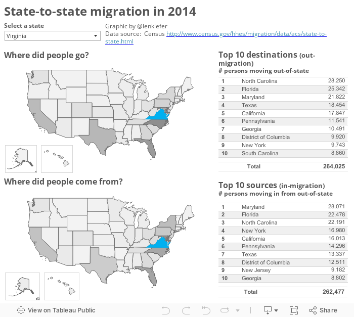
### Original based on 2014 data:
```{r}
htmltools::includeHTML("migtableau.html")
```
Notes
=====================================
This is a remix of a visualization I made with Tableua: https://public.tableau.com/profile/leonard.kiefer#!/vizhome/State-to-statemigrationin2014/Mobilitygraphic
The data come from the U.S. Census Bureau: http://www.census.gov/data/tables/time-series/demo/geographic-mobility/state-to-state-migration.html
They show the number of people (aged 1 or older) moving between states in the U.S. and the District of Columbia in 2015. I excluded migration to/from Puerto Rico, U.S. island territories and foreign countries.
Table 1. State-to-State Migration Flows: 2015
Dataset: 2015 American Community Survey 1-Year Estimates
Universe: Population 1 year and over